
A tour-description page on your website has eight seconds (or less!) to capture attention before a potential guest clicks away. Within those crucial moments, your ideal guest is hunting for specific information: price, duration, meeting point, and what makes your tour special. Miss delivering these details quickly, and you’ve likely lost the sale.
Most tour operators focus endless hours crafting compelling narratives about their experiences, yet they overlook two very important elements that actually drive bookings: the at-a-glance section and reasons to act. These components, when properly implemented, can transform casual browsers into paying guests—often making the difference between a sale and a missed opportunity.
This transformation isn’t about fancy design or elaborate storytelling. It’s about understanding how people actually make purchasing decisions and positioning key information exactly where they expect to find it. And when you understand and master these pieces, your results will speak volumes.
Essential components of an at-a-glance section
The old saying rings true: “If you confuse, you lose.” Potential guests shouldn’t have to hunt through paragraphs of text or scroll endlessly to find basic tour information. That’s where the at-a-glance section becomes crucial—a quick snapshot of essential details positioned strategically near the top of your page.
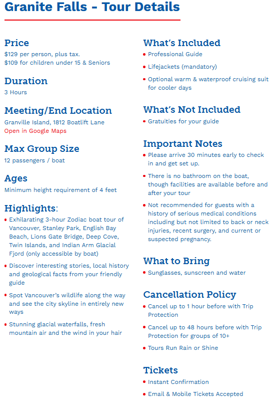
Your at-a-glance section should include the following:
- Price (or “starting at” for variable pricing)
- Departure times
- Tour duration
- Meeting point with clickable Google Maps link
- Group size and tour type (private vs. public)
- What’s included/not included
- Key highlights or benefits
Best practices for implementation
Leading online travel agencies have mastered the art of information presentation. They consistently position essential details prominently, using clear formatting and concise bullet points. For example, TripAdvisor’s “Tour Snapshot” and Viator’s “Experience Details” sections exemplify effective information organization.
Successful tour operators like Vancouver Water Adventures optimize their at-a-glance sections using these design elements:
- Two-column layouts for efficient information scanning
- Bold headings for easy navigation
- Condensed formatting to minimize scrolling
- Gray call-out boxes to distinguish the section

Creating urgency through reasons to act
The second important element—reasons to act—addresses a fundamental sales principle: Delay is the death of the sale. While many tour operators rely solely on promotions or discounts to create urgency, every tour business has natural scarcity built into their offering.
Your tour business likely has one or more of these inherent limitations that can create authentic urgency:
- Limited seating capacity
- Time-specific departures
- Regular sell-outs during peak periods
- Seasonal availability
- Dynamic pricing structures
Effective implementation strategies
Leading tour operators demonstrate the following ways to incorporate urgency:
- Direct messaging
Bulldog Tours effectively communicates limited availability: “We happily accept walk-up participants. But please note, space is limited. Tours often sell out, so without a reservation, we may not be able to accommodate your party.”
- Strategic placement
Vancouver Water Adventures positions urgency messages in multiple locations:
- Below the at-a-glance section
- Next to the booking button
- Within the availability calendar
- Dynamic pricing alerts
Fat Tire Tours leverages pricing strategy to create urgency: “If you have flexibility with your travel dates, we encourage you to click around the calendar to find the lowest price. Should you wish to book last minute for a day with limited availability, the price may be higher.”
- Real-time availability
Some booking systems display remaining seats, creating immediate urgency. Messages like “only 3 seats left” can be powerful motivators for immediate action.
Best practices for implementing urgency include these strategies:
- Use authentic scarcity messages based on real limitations
- Position urgency indicators near action buttons
- Implement dynamic pricing strategies with clear communication
- Utilize visual elements like countdown timers for promotions
- Highlight peak season limitations and pricing differences
Additional optimization strategies that help you maximize the effectiveness of your tour description page include the following:
- Use prominent banners for special promotions
- Implement countdown timers for limited-time offers
- Highlight weekday pricing advantages
- Display real-time availability when possible
- Use distinctive visual elements to draw attention to urgent messages
Want to learn more about how to create tour descriptions pages that convert? Download the free Tour Descriptions Workbook, courtesy of our friends at Guest Focus! Kelsey Tonner is the founder of Guest Focus Tour Business Coaching, and for two decades he’s been helping tour business owners as a mentor, consultant, speaker, experience designer, guide trainer, and award-winning tour leader. Since 2015, their programs have helped over 2,000 tour operators from 75-plus countries around the world, and Kelsey has been a regular speaker at over 35 industry events and conferences.
Top image: ©fivan/Adobe Stock